Have you considered the impact that your business logo has on current and potential customers? What about your website layout or font choices?
All of these details have a significant influence on the effectiveness of your business’s online presence, so it may be time to rethink your approach.
This blog will break down the most significant and detrimental design mistakes you may be making and the best ways to improve them.
Here are the design details you may be overlooking and that are ultimately influencing your online success.
Don’t get lost in your look!
While the visuals that make up your branding, whether it's on your website, social media or logo, should be visually appealing, this should not be the only focus of your design choices, however.
Instead, make sure to maintain a balance between this visual appeal and driving your online goals. So, if you hope to encourage action on one of your website pages, the visual should be clear, functional, visible and eye-catching rather than designed in excess.
Ultimately, you should have your strategies for different online touchpoints established so you can then create a concise design to motivate the actions you want from website visitors or social media users.
So, be purposeful, thoughtful and direct with your designs as you look to encourage customers to take action!
Color may be fun and eye-catching, but it can become distracting if it is not thoughtfully executed.
While it may seem like a way to keep your visual content interesting for viewers, followers and customers, instead, you may be driving them away from your posts or website.
To combat color overload, try putting together a color palette for your business. This palette can be utilized for social posts, website design and any other online branding. This palette will create consistency in your brand by building visual recognition.
You can still have variety by offering different branded colors that you use depending on where you post, what you post, the pages a user is on and more. Veering outside of this palette variety can create difficulty for a customer to focus on critical elements of your page or post, so stay within your brand-focused color choices.
Learn more about the power of color and how to include color theory in your design strategy by checking out this blog!
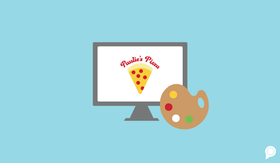
You may be making this next mistake in one of the most important aspects of your business — the logo.
It is necessary to stay ahead of trends in design and marketing, but this should not apply to your business’s long-term brand identity.
When you are putting together your logo, make sure it is something easily recognizable and can withstand the test of time. No brand wants to fall to the wayside or not be chosen by a potential client or customer because their logo looks outdated or, on the other hand, too modern.
Consider the fonts you are using, the visuals you are implementing and more to develop a logo that doesn’t fall within the category of “trendy.”
Simply put, you don’t want your logo to be definitive of a certain period of time. Instead, it should remain timeless, no matter the design trends that are popular at the time.
To put it into perspective, think of brands like McDonald's or Nike; the logos are simple and relevant no matter the time.
Again, a lot of what makes creating a successful design for your business is simplicity and consistency, and the same applies when using typefaces.
Typefaces are lettering designs that every designer uses to create wording on a website, advertising and social media posts. And it is possible that you may have overlooked your strategy in choosing and utilizing certain typefaces for your brand.
Take RevLocal’s typeface choices as a reference:

Here, there are two clear typeface styles, one for the header of the page and the other for the subheading below. As you cruise through the website, you may notice that this is a consistent pattern on every page. The typeface does not vary beyond the two styles and this extends to anywhere you find RevLocal branding.
The same should go for your website and online content. With set styles of typeface, usually using two to three different types, you will be able to maintain that same consistency that we highlighted with your brand’s usage of color.
So, do not continue to jumble up your online presence and website creation with an overwhelming number of typefaces. Keep it minimal and straightforward and you will see this design choice pay off!
Design makes a significant impact on the success of your business’s branding, website construction and more. There is a lot of thought that goes into creating designs that are representative of your business, and they should be done with thoughtfulness and a detailed-oriented perspective.
Ultimately, creating longevity and clarity in designs for your business will allow for continued online success.
There's so much that goes into properly representing your brand online, not just design! Make sure to set up a demo with one of our experts to strategize different options to help with branding your business by clicking here.

Anne Karasarides, Content Contributor
Subscribe to our email list to get the latest digital marketing content delivered to your inbox each week!